New corporate identity for Libertas Leiden
2015 | Libertas Leiden

Libertas Leiden is specialized in senior healthcare, housing and social support for the residents of Leiden. Late 2014, the changing Healthcare market prompted a new strategy and positioning. After agency selection, Designink was chosen to develop the new corporate identity.
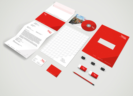
During a period of six months we went from overall concept to every aspect of the new corporate identity, from logo to website to signing. Libertas Leiden operates over 14 locations which are scheduled to reflect the new identity.


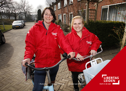
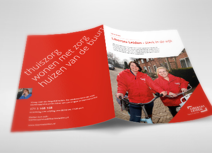
The brand promise is communicated explicitly through a new slogan or pay-off ‘Sterk in de wijk’ (i.e. ‘Strong neighbourhoods’). This is enforced by colour, open typeface and distinct visual element (corner). Strategically, three key sectors are highlighted; homecare, healthcare and social innovation.

Libertas is the goddess of individual liberty and freedom. Alliterative names can help you stand out in the crowd; the double “L” connects , embraces and shows perspective.
Communication: Accompania
Website: Movenext
Photography: Edwin Weers
