Can a font help ‘cure’ dyslexia?
Blog | 2013

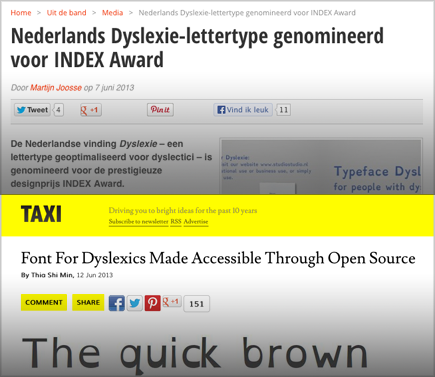
A week ago it was announced that the Dutch typeface ‘Dyslexie’ has been nominated for the International Index Award. Noteworthy, one might think. Yet it is doubtful whether this font is really useful. The typeface doesn’t seem to have much research backing it. There is also discussion about it’s aesthetic qualities and pricing.
Competition
Last year, another font ‘OpenDyslexic’ made news-headlines. This font is not only free (open-source), but can also be viewed by using a special web-browser (Open Web). By now, OpenDyslexic has received much positive attention. However, it is questionable whether the quality of this font is any better than the Dutch ‘Dyslexia’.
Alternatives
There have been other fonts created for dyslexics and the visually impaired. See for example ‘FS Me’ (Font Smith) and ‘APHont’ (American Printing House for the Blind). Very promising is the PhD research ‘Type Design for children with visual impairment’ by Ann Bessemans. This research resulted in a new font ‘Matilda’ (not yet available). For more information, see; Interview BrailleLeague (Dutch) and Interview Typo Berlin 2013 (English).
Image: overview of fonts in two categories

Marketing vs. Craftmanship
A few years ago there was a more-or-less similar discussion about ‘Ecofont’. Supposedly, this typeface would save ink by using tiny ‘holes’ in the type design. Bollocks! according to professional typographers, because well-designed fonts would be much more economical (Gulliver by G. Unger for example). The Ecofont was just a ‘smart’ marketing stunt.
Evidence
There is, as of yet, no evidence proving that the font Dyslexia helps. There is mention of positive user-feedback, but this is probably related to the ‘placebo effect’. It seems more likely that extra-large letter spacing is more useful in improving reading in dyslexia.
