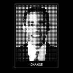
Obama: black, blue or red?
The heart of Obama’s presidential campaign was social media, people say. Now we all know the devil (or truth) is in the details, but nevertheless, the tidal wave of portraits (icons) of Obama reign the web. Artists, designers and even worldfamous photographers like to get a piece of the pie. Today it was time to dive into the subject and make my own contribution…
The interview with Shephard Fairey made clear what the power of an image can mean (how ‘Hope’ went viral). This example (Faireys design) is one among thousands (see for example the Flickr Photostream), but also spinoffs like the photoshop-competition from the Huffington Post (alter the Official Obama images of Annie Leibovitz) clearly create ground for creativity. If you are interested in the real campaign, please read the book ‘From Rotterdam to the White House’ by Kirsten Verdel. But back to the subject, what determines the real persuasive strength of the image. Is it the artistic intention, uniqueness or is it all about the energy you direct at the marketing campaign? Communication for dummies, one might say, but in this example more complicated, because it is hard to standout from the rest. But why?
Well, maybe because he is so close? Last week my collegue tried to create the (not yet existing) Twitter-username of ‘B-Obama’ and was caught by a smart bot that diverted all attempts to use ‘O’s identity. Or maybe it was just Obama’s webcare-team? Anyway, the illusion is there, the magic of his persona (aura) is mesmerizing and we follow the hype. In The Netherlands, the most cloned portrait of a politician is probabably that of G-W (Blondie), but his portrait i will not touch. To shorten the lengthy road, see the triptych. The next exercise would be to measure the popularity of each color by research agencies or create a heatmap for marketing purposes.


